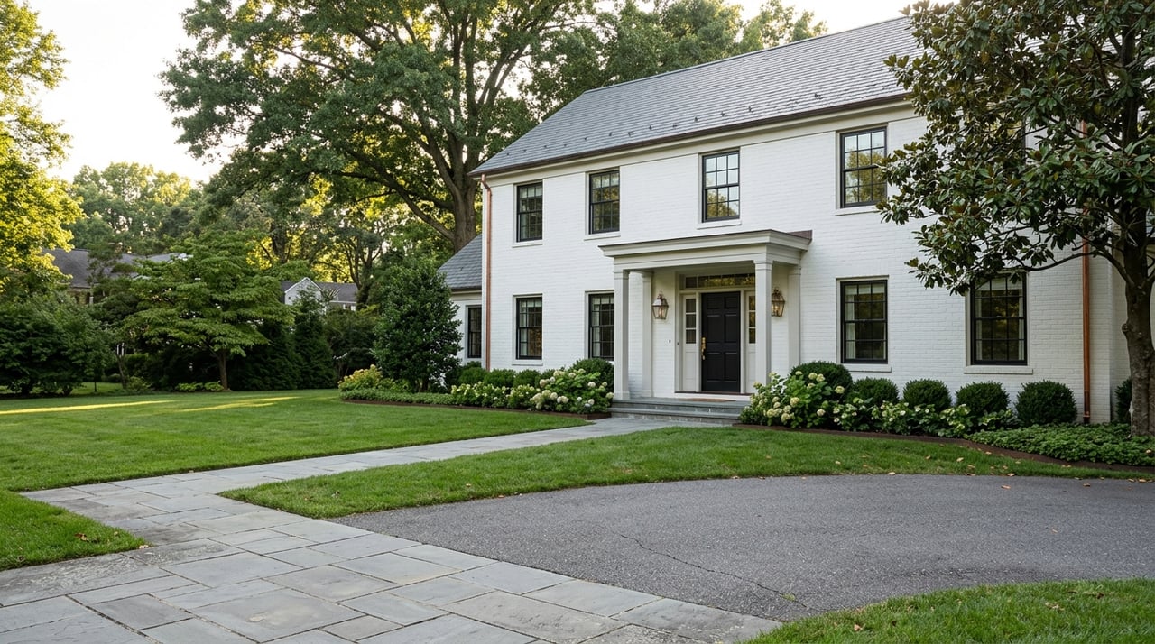
Color has the power to transform a space, influencing how it feels and functions. In Washington, D.C., where architecture ranges from stately historic homes to sleek modern condos, choosing the right paint tones can enhance both character and comfort. Every shade evokes a mood—some energize, others calm, and many bring balance to the rhythm of daily life. Understanding how color interacts with light, texture, and emotion allows homeowners to design interiors that reflect both personal style and practical needs. This guide unveils how to select paint tones that elevate every room in the home.
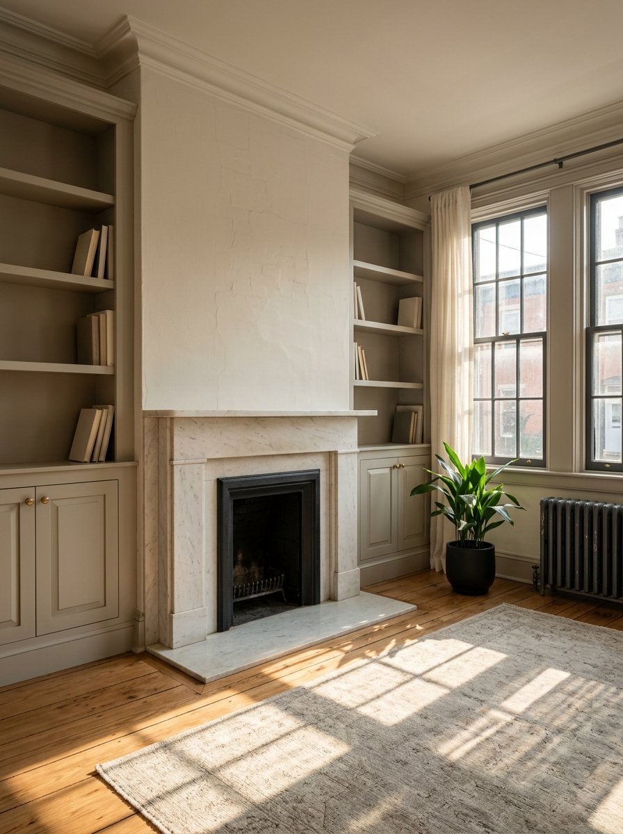
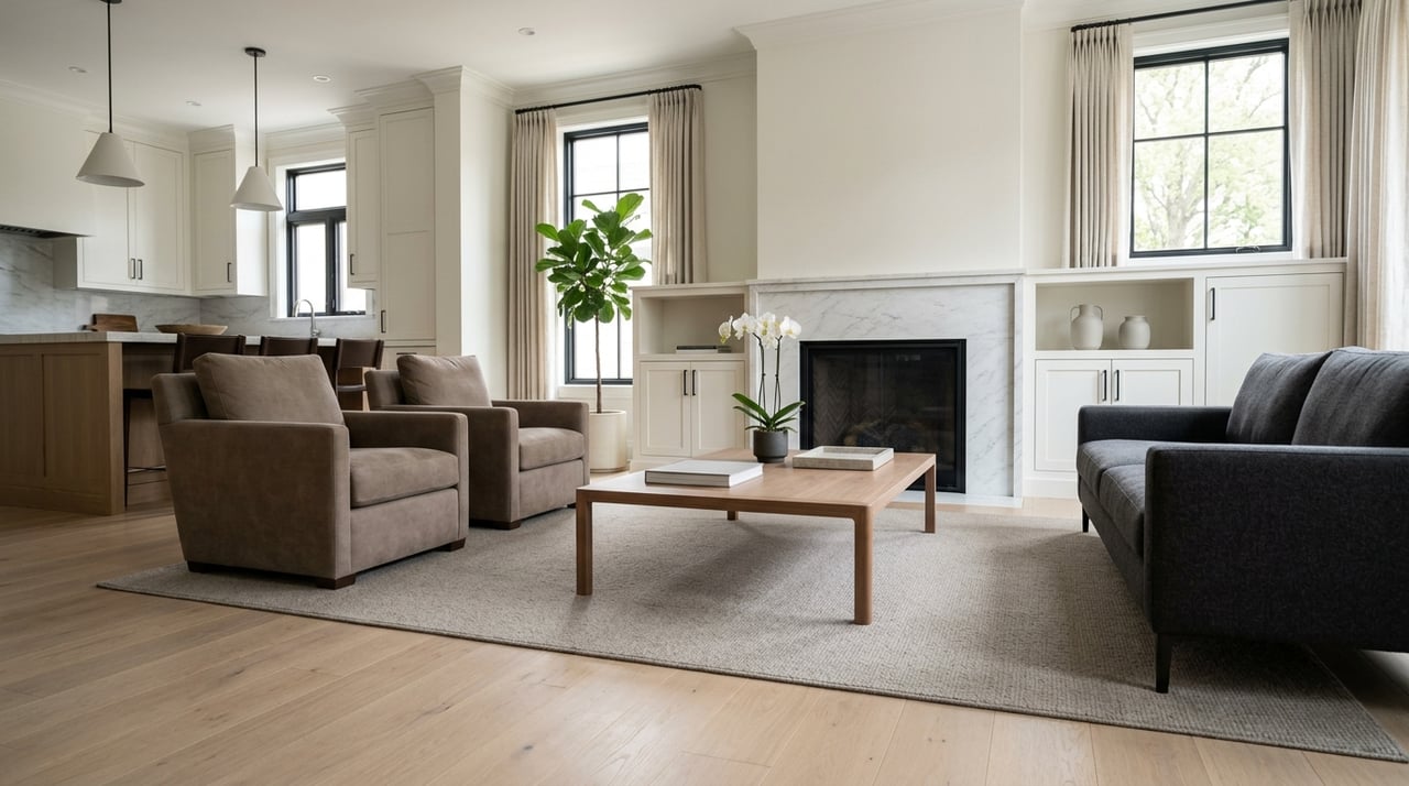
Living Room: Welcoming and Social
The living room serves as a gathering space, making it ideal for colors that promote conversation and comfort. Warm tones like soft oranges and yellows can stimulate energy and sociability. Alternatively, earthy neutrals provide a versatile backdrop, allowing furniture and artwork to stand out while maintaining a cozy environment. Incorporating accent colors through throw pillows or artwork can further enhance the room's vibrancy. It's essential to balance bold hues with neutral tones to prevent the space from feeling overwhelming.
Kitchen: Appetite and Activity
Kitchens benefit from colors that stimulate appetite and activity. Warm hues such as red, orange, and yellow are known to encourage eating and conversation. These colors can make the space feel more inviting and energizing, enhancing the cooking and dining experience. Pairing these hues with stainless steel appliances or wooden accents can create a balanced and appealing aesthetic. It's important to consider the kitchen's layout and lighting when selecting paint tones to ensure the space remains functional and visually appealing.
Bedroom: Restful Retreat
For bedrooms, it's essential to choose colors that promote relaxation and restful sleep. Soft blues, greens, and muted purples are known for their calming effects, helping to lower heart rates and reduce stress. These shades create a serene environment conducive to rest. Incorporating natural elements like wooden furniture or soft textiles can enhance the room's tranquility. It's advisable to avoid overly stimulating colors, such as bright reds or yellows, which may interfere with sleep quality.
Bathroom: Clean and Refreshing
Bathrooms should evoke a sense of cleanliness and freshness. Light blues, seafoam greens, and crisp whites can make the space feel airy and spa-like. These colors contribute to a refreshing atmosphere, enhancing the overall bathroom experience. Incorporating reflective surfaces like mirrors or glass can amplify the lightness of the space. It's essential to choose moisture-resistant paints to prevent mildew and maintain the room's cleanliness.
Home Office: Focus and Productivity
In home offices, selecting colors that enhance focus and productivity is crucial. Muted greens, soft grays, and earthy neutrals are known to promote concentration and mental clarity. These tones create a balanced environment that supports efficient work habits. Adding personal touches like artwork or plants can make the space more inviting without causing distractions. It's important to ensure the chosen colors complement the office's lighting and furniture to create a cohesive and functional workspace.
Accent Walls: Adding Depth and Interest
Accent walls are an effective way to introduce bold colors without overwhelming a room. Deep blues, rich reds, or vibrant yellows can add depth and focal points to a space. When used thoughtfully, accent walls can enhance the room's aesthetic and highlight architectural features. It's essential to choose an accent wall that complements the surrounding colors and doesn't clash with existing décor. Incorporating textures or patterns on the accent wall can further enrich the room's visual appeal.
Lighting Considerations
Lighting plays a significant role in how paint colors appear. Natural light can make colors look more vibrant, while artificial lighting may alter their hue. It's essential to test paint samples under different lighting conditions to ensure the chosen color achieves the desired effect in the room. Darker rooms may benefit from lighter paint tones to enhance brightness, while well-lit spaces can accommodate deeper hues. Considering the direction of natural light and the type of artificial lighting used can help in selecting the most flattering paint tones.
Color Harmony and Balance
Achieving color harmony involves selecting colors that complement each other and create a balanced look. Using the color wheel as a guide, one can choose analogous colors for a harmonious feel or complementary colors for contrast and vibrancy. Balancing warm and cool tones also contributes to a cohesive design. It's important to consider the room's function and desired mood when selecting colors to ensure they align with the space's purpose.
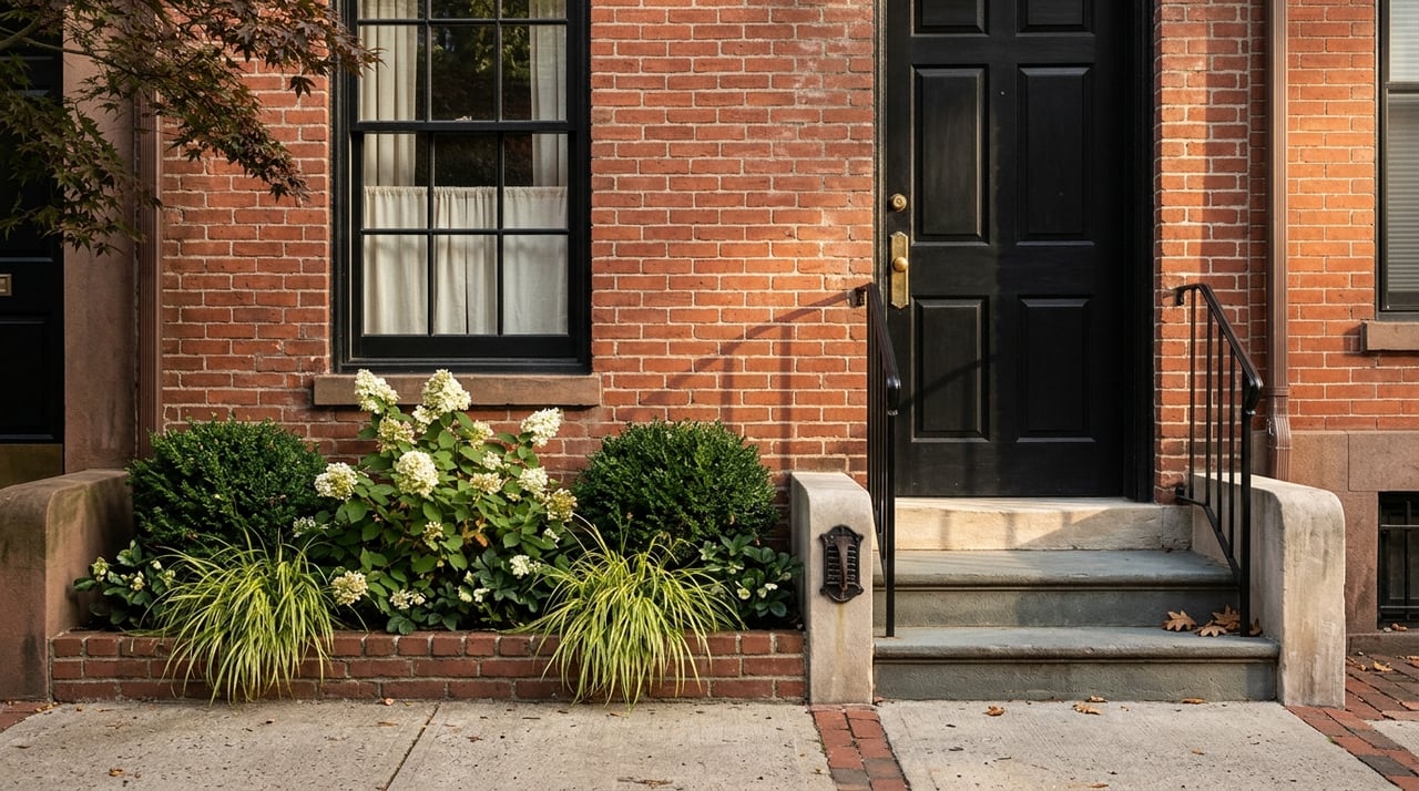
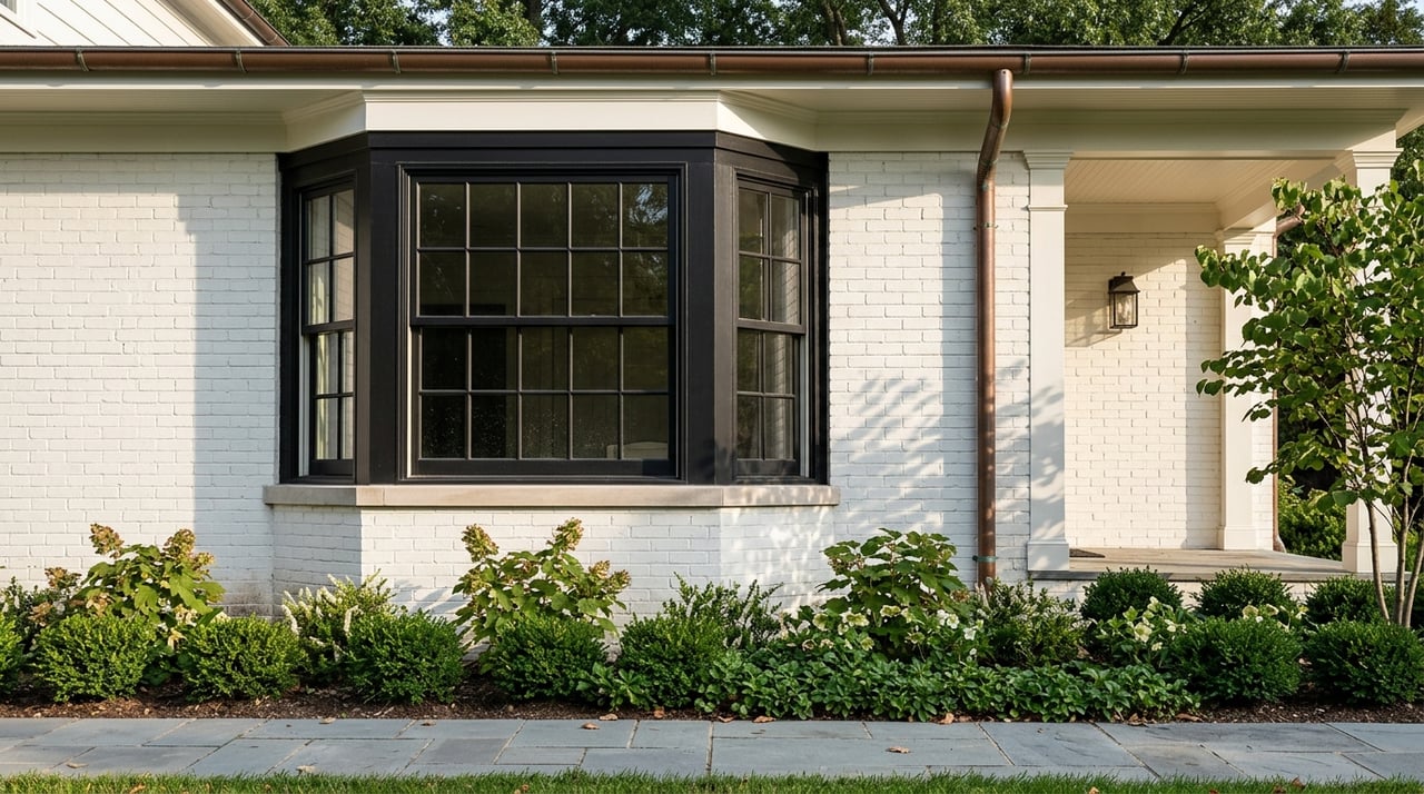
Trends in Washington, D.C.
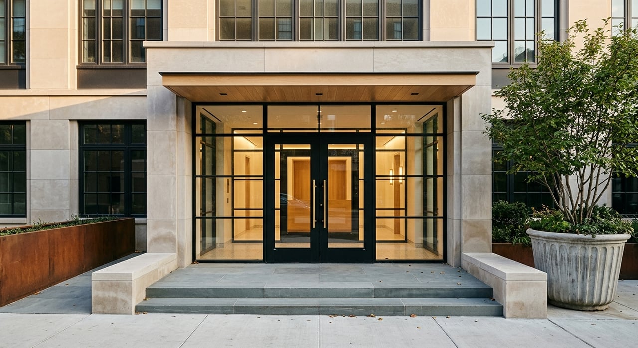
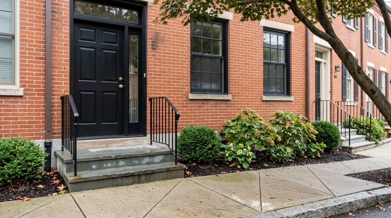
In Washington, D.C., design trends reflect a balance between timeless elegance and modern simplicity. Many homeowners are embracing soft neutrals such as warm grays, taupes, and off-whites to complement the city’s mix of historic and contemporary architecture. Deep navy, forest green, and charcoal are also gaining popularity for creating sophisticated yet inviting spaces. Accents in muted gold, terracotta, or rust add warmth and personality without overpowering the design. These versatile tones work beautifully with both traditional millwork and sleek, minimalist furnishings, allowing D.C. homes to maintain their charm while feeling fresh and current.
Start Your Next Home Journey
Finding the perfect home in Washington, D.C., begins with understanding your needs and exploring available properties. Whether you’re seeking a modern apartment or a historic townhouse, contact
Catherine Triantis today to begin the buying process with confidence.
*Header photo courtesy of Unsplash